Giving My Flat-Looking Blog a Terminal-Style Look
3 min read634 words
I changed how this blog looks. The colors are now dark green and lime, and the site name and headings have terminal-style symbols. I also put an access counter in the header, and updated the icons and the OGP image to match the new colors. This post records why I changed the design and how I chose it.
It didn't stick in my mind
A few days after starting this blog, I felt that it somehow didn't leave an impression. It looked flat and lacked originality. But I couldn't put into words what exactly made it look flat.
Not being able to put feelings like this into words is something I'm working on right now.
I wanted some originality
This blog already had elements from 2000s-era blogs, such as an access counter and 88×31 banners. But they were all near the bottom of the sidebar, so you couldn't see them when you first opened the blog. The design itself was clean and modern, and the retro feel hardly came through.
So I decided to bring the access counter and the retro feel to the front. I wanted a look that only this blog has, so that people who visit remember it, even a little.
Instead of trying to decide the look in words first, I decided to compare real designs and pick one.
Choosing from three prototypes
I made prototypes of three different directions and compared them side by side, in both light and dark mode.
Option | Colors | Decorations |
|---|---|---|
A | Off-white and vermilion | ★ before the site name, ■ before dates |
B | Dark green and lime (terminal style) | A blinking cursor after the site name, dates in |
C | Purple and pink (2000s personal website style) | Pixel fonts, ☆彡, double-line borders |
I chose B. I wanted a techy look, and simply put, B looked the best of the three.
What changed
Here is the top page before and after the change.
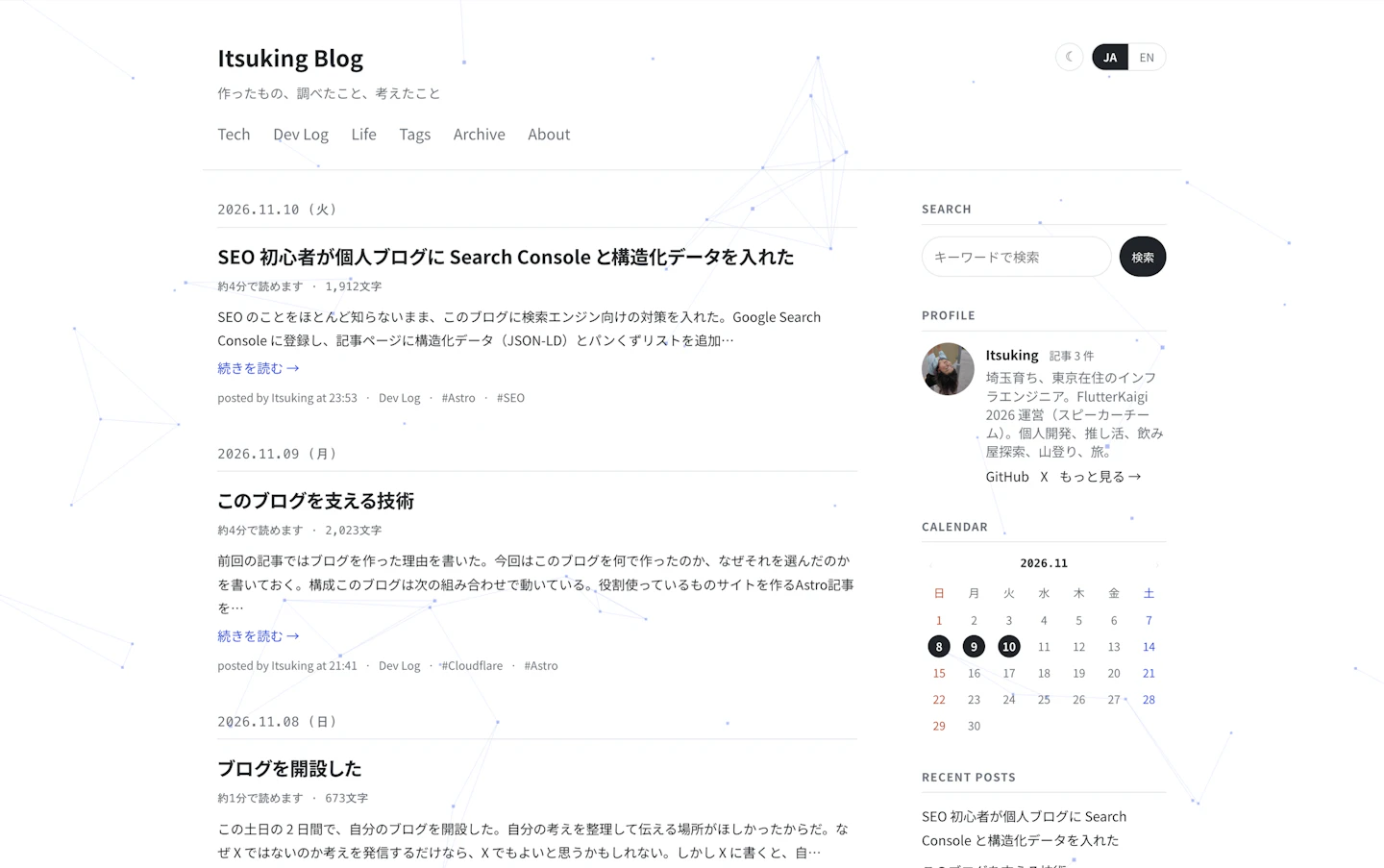
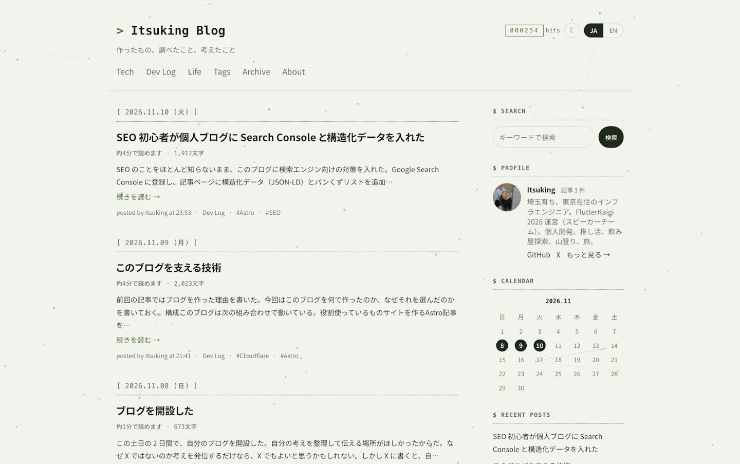
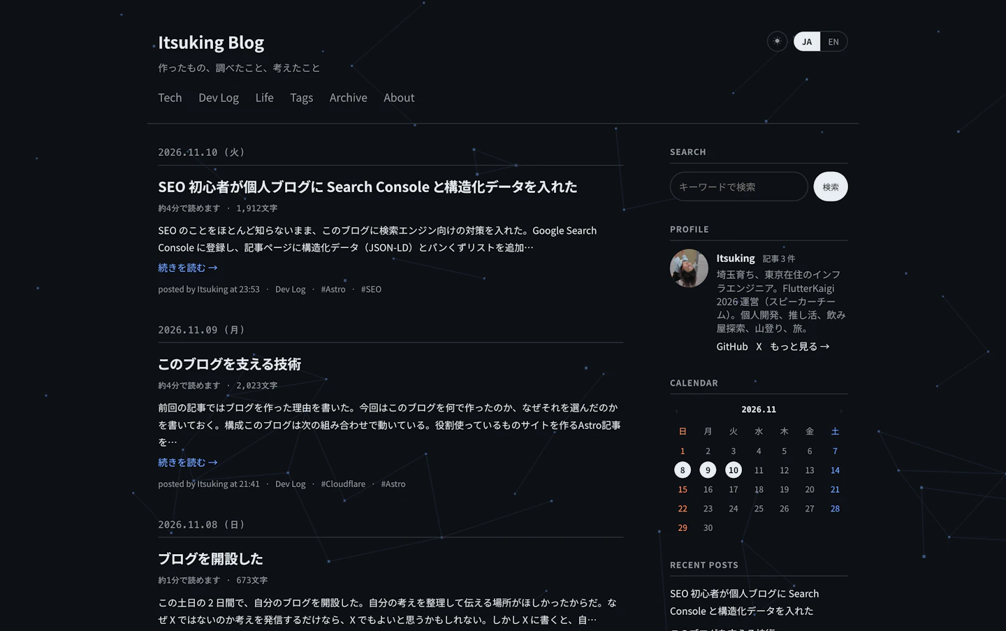
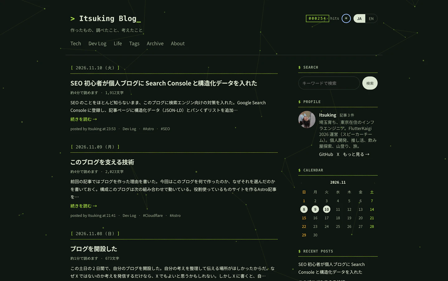
- Colors: The white and black with blue became a greenish background with a green accent. The dots and lines moving in the background are green too
- Site name: It now reads
> Itsuking Blog_, like a screen where you type commands. The_at the end blinks - Date headings: Dates are now in square brackets, like
[ 2026.11.10 (Tue) ], with a dotted underline - Sidebar headings: They now start with
$, like$ SEARCH - Access counter: It used to be only near the bottom of the sidebar. Now it also appears at the top right of the header, where you see it as soon as you open the blog
Keeping the decorations out of the way
The new symbols and the blinking are decorations, so for some people they can get in the way of reading. I did two things to prevent that.
The first is about the blinking. Mac, iPhone, and Windows have a setting to reduce motion on the screen. People who feel sick from moving things, or who find it hard to focus on reading when something moves, use it. For people with this setting turned on, the _ after the site name is shown without blinking.
The second is about the symbols. Screen readers, which read the text on the screen aloud, read whatever text is there. Without any changes, the site name would be read as something like "greater-than Itsuking Blog underscore." >, _, [ ], and $ are decorations with no meaning, so I made screen readers skip them. The site name is read simply as "Itsuking Blog."
Matching the images
Changing only the site itself isn't enough if the images people see outside the site are still blue. So I remade these in the new colors too:
- The OGP image shown when a post is shared on social media
- The icon shown in browser tabs and on phone home screens. I replaced my profile photo with
>_. For the small icon in browser tabs, I drew it as pixel art so the lines don't blur - This blog's own 88×31 banner
Thanks for the clap!